A Mobile Friendly Dashboard Using IBM Cognos Analytics
This article addresses how you can turn an existing dashboard that was built using IBM Cognos Analytics into a mobile friendly dashboard with only few steps.
I will be highlighting a new extension that was recently released on the IBM accelerator catalog. The extension will work with IBM Cognos Analytics version 11.1.6.
Download and install the mobile layout extension:
Before we begin, you will need to download and install the mobile support extension from the IBM accelerator catalog.
If you are not familiar with extensions, they are zip files that can be deployed in your Cognos Analytics environment and can be used to alter or add new functionality. I will be covering more about the IBM Cognos dashboard extensions in future articles, so stay tuned!
After installing the extension, refresh your browser window and open the dashboard that you would like to turn into a mobile friendly dashboard.To learn cognos visit:cognos online training india
Enable the mobile support in your dashboard:
Once the extension is installed, launch your dashboard and open the properties panel. Under the page size section, you will see a new property called Responsive layout (experimental).
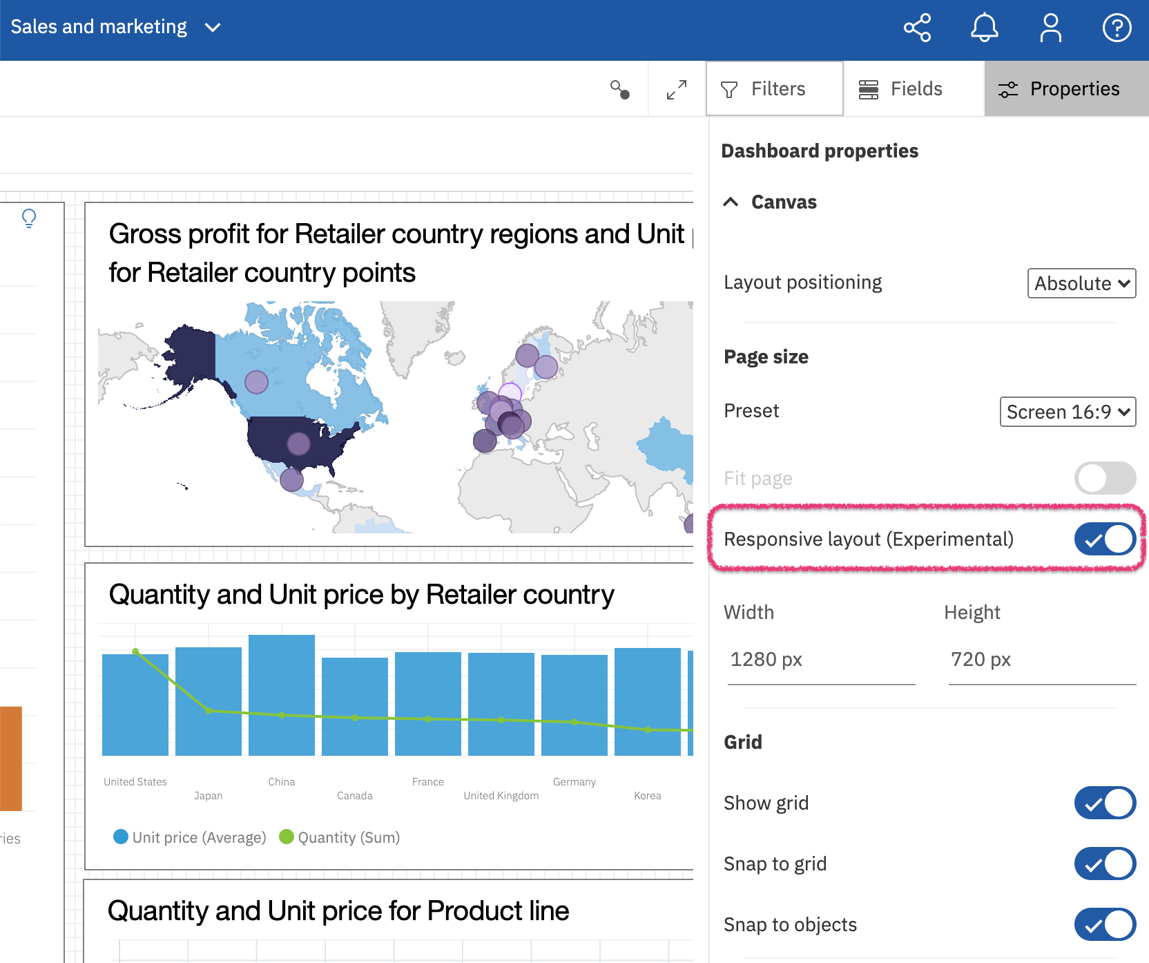
Enabling this property will automatically start adjusting the dashboard layout when it is viewed on a mobile device. No other changes are required to the dashboard itself.
Enabling this extension will automatically improve the tabs, page layout, dialogs and interactivity within your dashboard.
Hold on a second, is that it ?
Yes, that is pretty much it. Although this extension will automatically adjust your viewing experience, you can still further customize your mobile layout. This will be covered later in the article, but before we get into more details, let’s delve into how enabling this property will automatically improve your dashboard mobile consumption.
Content layout changes:
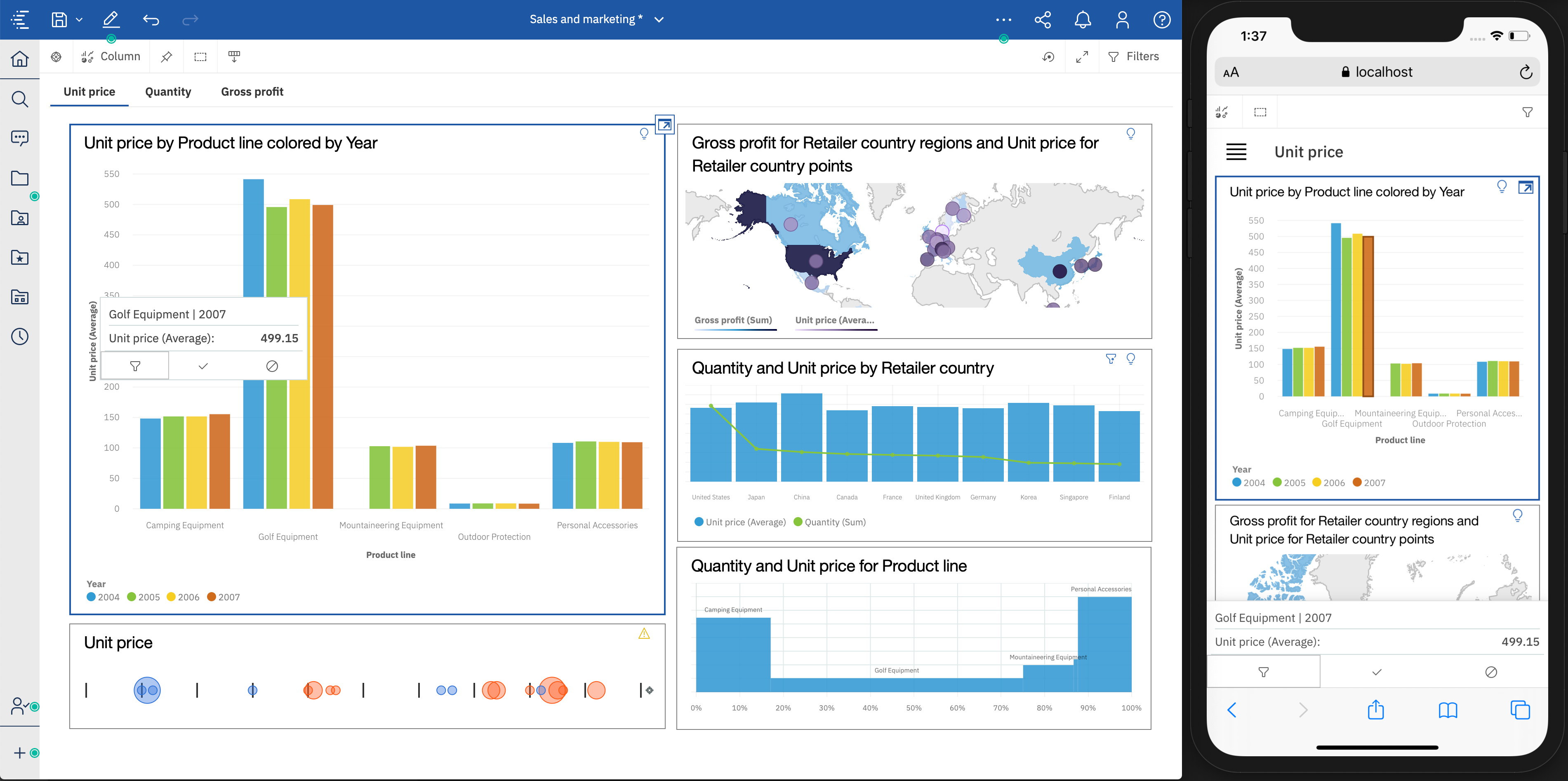
- The application and navigation bars will be hidden on a smaller screen (i.e. phones), but will be visible on a larger screen like an iPad.
- The tabs in the dashboard will be displayed as a menu when viewed on a mobile device.
- The page content will be displayed in order and will be resized to fit the mobile device screen. The content size will be optimized for smaller screen consumption based on various rules including the existing aspect ratio of the content as well as the type of the content.
Dialogs and toolbars
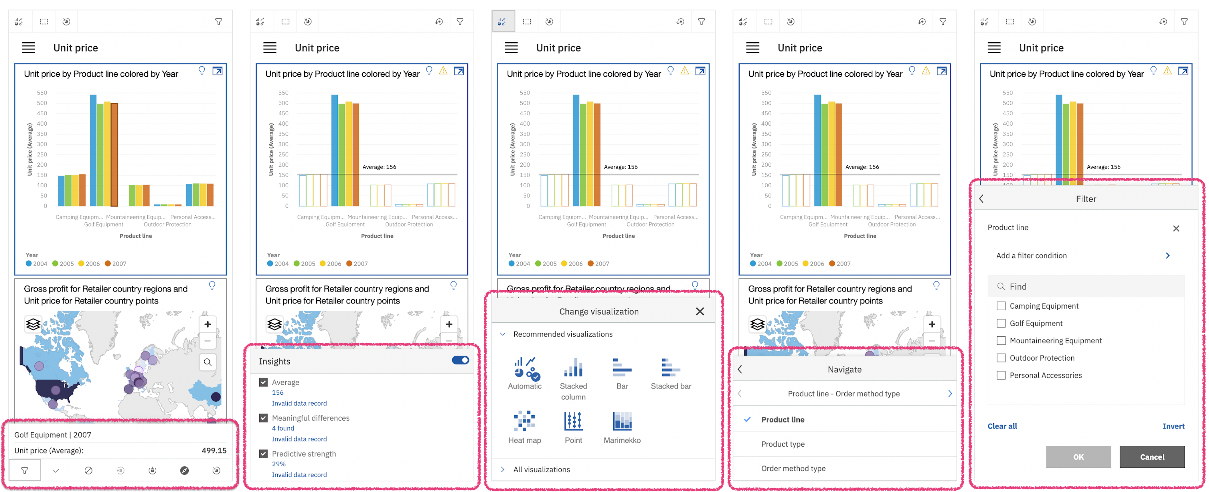
Toolbars, dialogs and tooltips will be displayed at the bottom of the application and will be resized to fit the screen.
Interactivity
- The visualization’s pan and zoom will be disabled by default. This is to avoid conflicts with the native pan and zoom on a touch device. To pan or zoom a map visualization, the map must be selected first using a tap gesture. Other visualizations can only be panned and zoomed when in maximized mode.
- Selecting a data point on a chart using a tap will highlight the data point and show the tooltip content and all the associated actions at the bottom of the application window.
- A second tap on a highlighted data point will select it and filter the other visualizations on the same page.
- A tap gesture on a selected datapoint will deselect it.
Customizing the mobile layout of the dashboard
Often times, depending on the purpose of the dashboard, you might want to display some content in a specific order. You might also want to display some content like summaries or visualizations side by side for comparison.
Here are some simple steps that will allow you to achieve this goal:
Reordering of the content
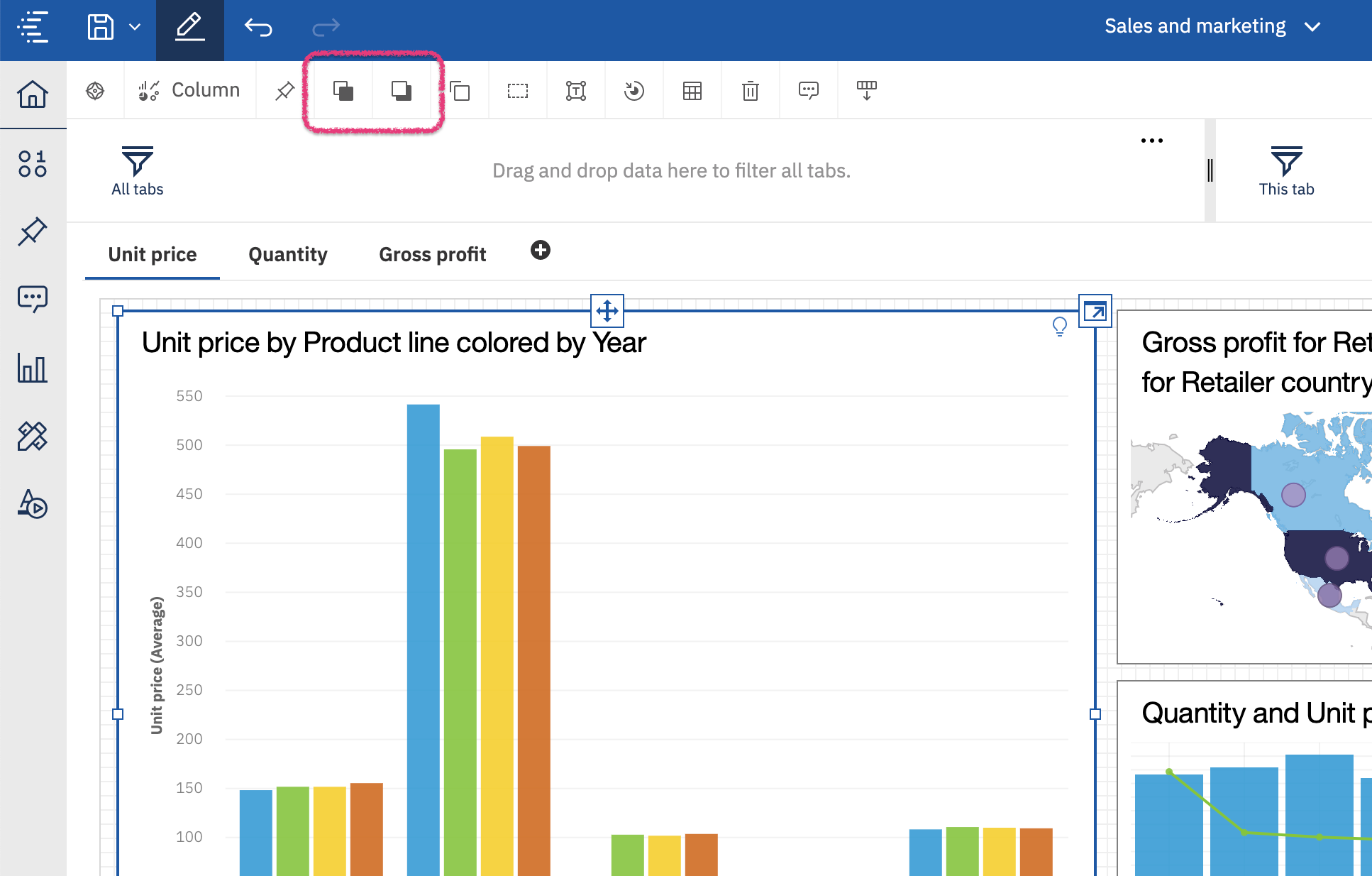
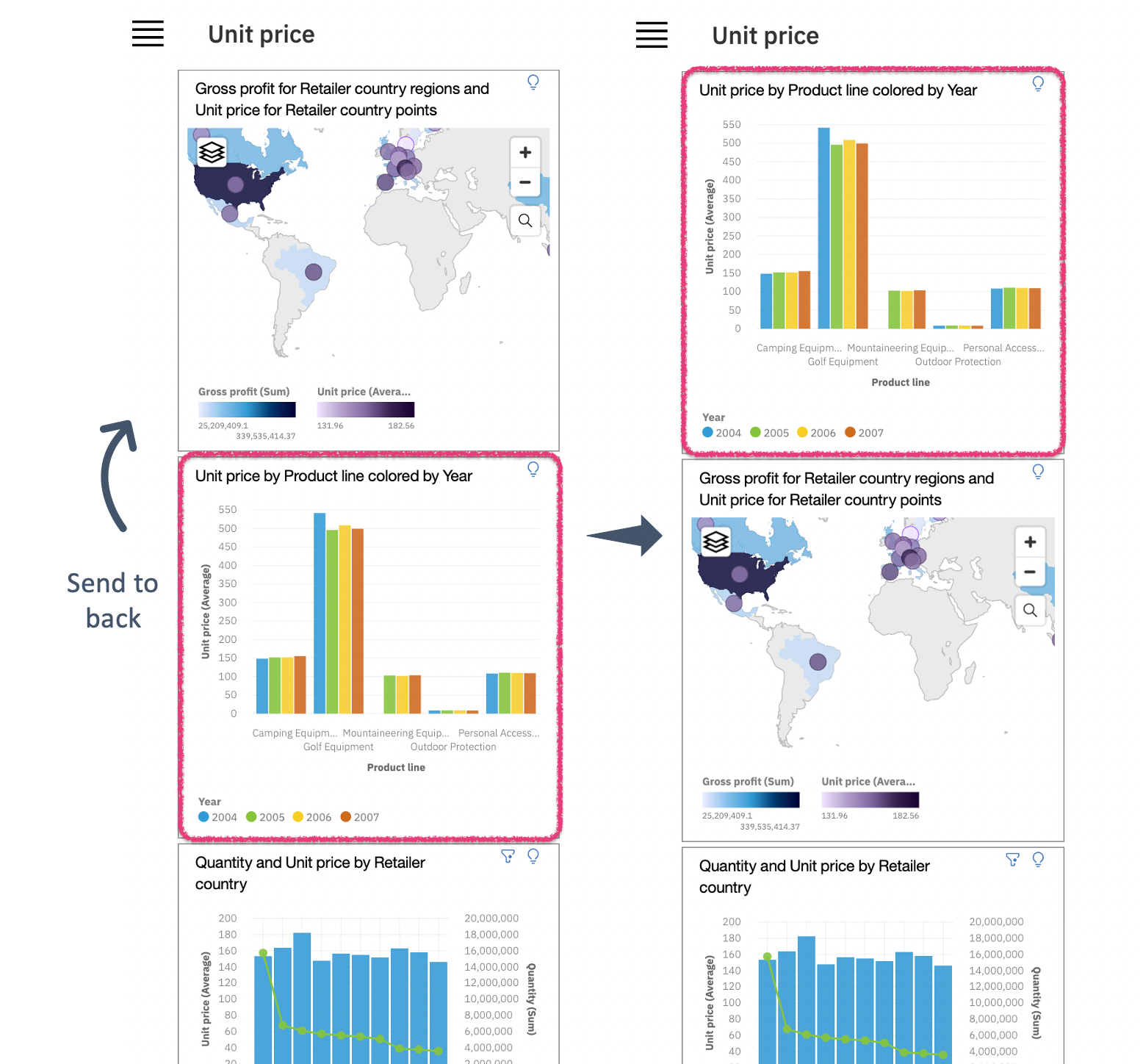
By default, the extension will automatically position the content in the order they were created in the dashboard. You can control and edit the order of the content by using the “Send to front” and “Send to back” actions in the dashboard editor. These actions are typically used for layering content, but are also used to decide which content comes first when viewing the dashboard on a mobile device.
The following might sound counter intuitive, but if you are a geek like me, it will make complete sense.
Select the content and then “Send to back” if you want to place the content at the top of your page. Alternatively, use the “Send to front” if you want to place it at the end of the page.
Grouping content together
The mobile extension will leave any grouped content untouched and will not attempt to adjust the size and position of the the grouped content.
The group action can be accessed in the dashboard editor when selecting two or more widgets.
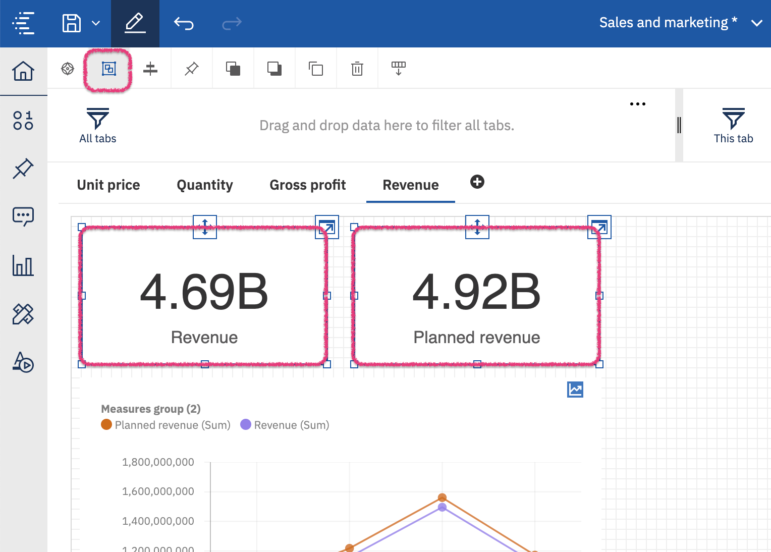
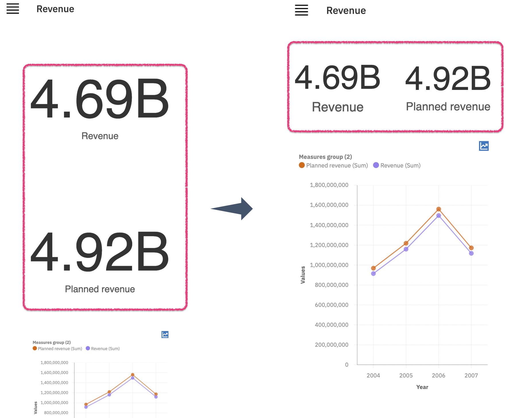
Grouping widgets together will maintain the same size and position of the widgets as they were authored on the desktop. The following example shows summaries before and after they were grouped together side by side. It also shows how they will be displayed on the mobile device.
Final thoughts
In most cases, you will find that this extension is what you need to render the dashboard properly on a smaller screen with minimal efforts.
There are some cases when this extension will not be suitable. One such case is when the dashboard contains layered content or relies on background images. One possible solution is grouping widgets to maintain the positions and the layering.
This is just one example of how extensions can be very powerful tools for adding new functionality that was not initially part of the released Cognos Analytics offering.
To more information visit:cognos online classes


Comments
Post a Comment